Lighting Your Haunt Part 1: Color Theory
Lighting is the fastest way to signal that something is wrong. Humans are hardwired to notice when light doesn’t look right: too green, too red, shadows where they shouldn’t be. A well-lit haunt doesn’t need elaborate props or expensive animatronics. The light itself does the unsettling.
This lesson covers color theory as it applies to Halloween atmospherics, from the science of color temperature to practical rules for mixing hues in a haunt.
Warm vs. Cool: Setting the Baseline
Color temperature is measured in Kelvin (K). Low numbers are warm (candlelight, amber, orange), high numbers are cool (moonlight, blue, white). Every light source falls somewhere on this spectrum.
| Temperature | Color | Feel | Halloween Use |
|---|---|---|---|
| 1800-2200K | Deep amber/orange | Intimate, ancient | Candles, firelight effects, Victorian gothic |
| 2700-3000K | Warm white | Comfortable, familiar | Baseline indoor lighting (before the scare) |
| 4000-5000K | Neutral white | Clinical, exposed | Asylum themes, laboratory scenes |
| 6500K+ | Cool blue-white | Cold, alien | Moonlight simulation, ghostly scenes |
Most haunts benefit from a baseline that’s either very warm (candlelight range) or very cool (moonlight range). The middle ground (3000-5000K) reads as “normal” and works against the atmosphere unless you’re deliberately contrasting it with a scare zone.
The Psychology of Color in Scares
Color bypasses rational thought. Your guests don’t consciously think “that light is green, therefore I should feel uneasy.” They just feel it. Here’s what each color does:
Red triggers alertness. It’s blood, fire, danger. Deep red (not bright red, which reads as festive) works in tight spaces, corridors, and anywhere you want heightened tension. Red is also the easiest color to see in low light conditions, so it preserves the dark feeling while keeping the space navigable.
Purple feels otherworldly. It doesn’t exist naturally in most environments, so the brain registers it as wrong. Combine it with fog and you get an alien, dreamlike quality. Purple works exceptionally well in large open areas where you want atmosphere without a specific theme.
Green signals decay. Swamp, poison, sickness, radiation. Green uplighting on a face turns a person into a corpse. It’s the go-to for witch themes, toxic waste, and zombie setups. Avoid bright neon green unless you’re aiming for camp.
Blue is cold and lonely. It reads as moonlight, underwater, or death. Blue is the most common base lighting color in professional haunted attractions because it provides enough visibility for safe navigation while maintaining a dark atmosphere.
Orange is warmth and fire. It’s the color of jack-o’-lanterns and bonfires. Used alone, it creates inviting autumnal scenes. Used as a contrast against blue or purple, it draws the eye to a focal point.
White (strobe) is pure disorientation. Strobing white light fragments motion, hides approaching threats, and triggers a primal alarm response. Use sparingly, and never in areas where guests with photosensitive conditions can’t avoid it.
The Three-Color Rule
Professional lighting designers follow a simple guideline: use no more than three colors in a single scene. More than three and the space reads as a party, not a haunt. Fewer than three and you lack depth.
Pick your palette:
- Base color: Covers the largest area. Sets the overall mood. Usually blue, purple, or deep red.
- Accent color: Highlights focal points (a prop, a doorway, an actor’s position). Should contrast with the base. Green against purple, orange against blue, red against blue.
- Punctuation color: Used briefly and deliberately for scares. Strobe white, sudden red, blacklight flash. This is the exclamation mark.
Example palette for a graveyard scene: Base: cool blue (simulating moonlight). Accent: green (uplighting tombstones). Punctuation: strobe white (triggered with a scare).
Example palette for a gothic parlor: Base: deep amber (candle range). Accent: purple (backlighting a portrait). Punctuation: red flash (at the moment the portrait “moves”).
Color Mixing
When two colored lights overlap, they mix. Understanding the basics prevents muddy, unappealing results.
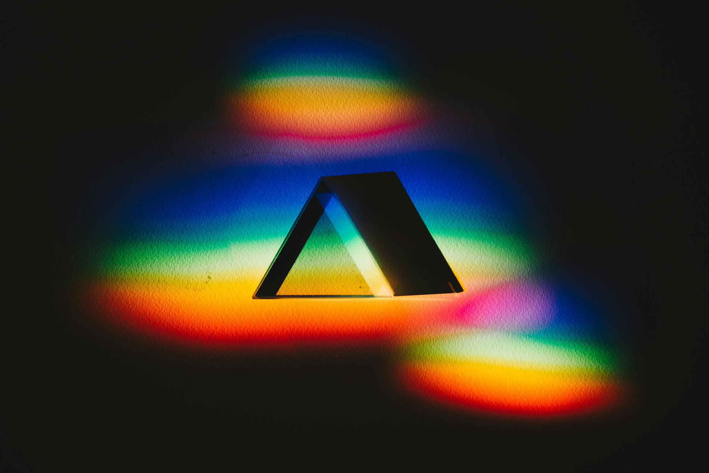
Red + Blue = Magenta/Purple. A rich, dramatic combination. Red + Green = Yellow/Amber. Useful for fire simulations, but in equal proportions it just looks dirty. Blue + Green = Cyan. Cold and aquatic. Good for underwater or ice cave themes. All three (RGB) at equal intensity = White. This is how RGB LED fixtures work.
The practical lesson: position colored lights so they illuminate different surfaces rather than overlapping. A green spotlight on the left wall and a purple spotlight on the right wall creates depth. If they overlap on the floor, you get a muddy gray-brown zone that weakens both colors.
Intensity and Contrast
The human eye adapts to ambient light levels. If your whole haunt is dark, a moderately dim light feels bright. If one area is well-lit, the next dark area feels pitch-black. This is contrast, and it’s your most powerful tool.
Start brighter, then go darker. Let guests acclimate to moderate light in the first zone, then reduce it as they go deeper. By the third or fourth room, even a single candle flame will feel like a spotlight.
Never go fully dark. Total darkness isn’t scary. It’s just annoying. Guests stop moving, start using their phone flashlights, and break the immersion. Keep enough light for basic spatial awareness (0.5-1 foot-candle minimum, or roughly “you can see shapes but not details”).
Use shadows deliberately. A single light source from below creates dramatic upward shadows on faces and props. Two sources from opposite sides create a narrow shadow in the center. Experiment with a single flashlight in your scene before committing to fixture placement.
Your palette and theory are set. The next lesson covers the actual hardware: which fixtures produce which effects, and what to buy for your budget.
Next up: Part 2: Fixture Types