Tombstone Workshop Part 1: Designing a Stone That Belongs to a Century
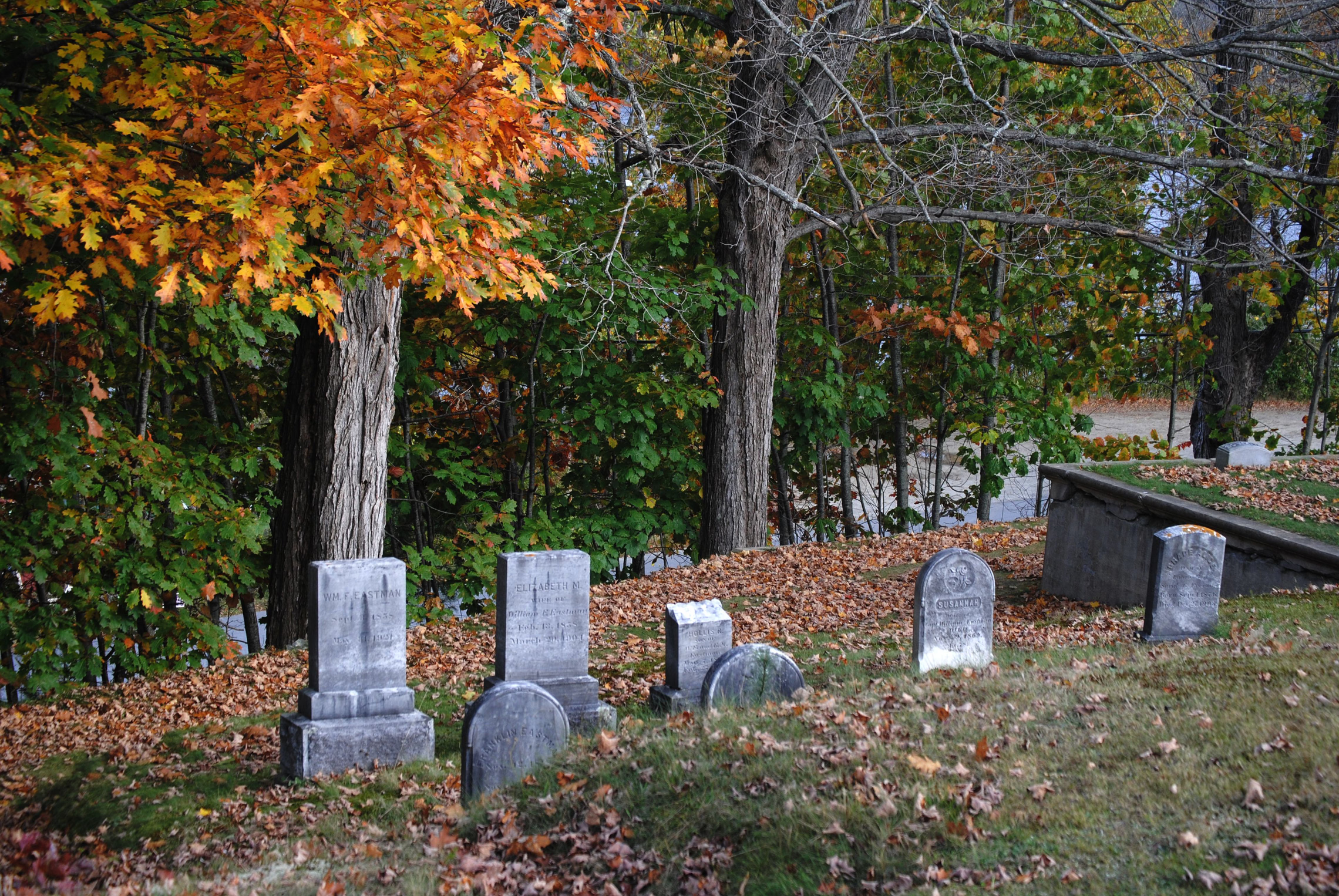
Our front-yard graveyard guide covers the whole yard: which foam to buy, paint that won’t melt it, layout and anchoring. This series goes deeper on the stones themselves. Part 1 is the design, before any foam gets cut. Part 2 carves it, Part 3 coats and ages it, and Part 4 sets it in the ground.
The history here comes from National Park Service publications and National Register nominations, the documents that describe real burying grounds stone by stone. The lettering layout and design transfer methods near the end are ours, not a record of how colonial carvers worked.
The Parts of a Stone
Name the parts before you draw them. The terms below are the ones the nominations use.
- Tablet. The National Park Service’s National Register Bulletin 41 defines it as “A rectangular gravemarker set at a right angle to the ground, having inscriptions, raised lettering or carved decoration predominantly on vertical planes, and top surface finished in straight, pedimented, round, oval, or serpentine fashion” (NPS, National Register Bulletin 41, glossary). Most yard tombstones are tablets.
- Headstone. “An upright stone marker placed at the head of the deceased; usually inscribed with demographic information, epitaphs, or both; sometimes decorated with a carved motif” (same glossary).
- Ledger. “A large rectangular gravemarker usually of stone, set parallel with the ground to cover the grave opening or grave surface.” A ledger is a flat slab on the lawn, and it’s the easiest stone to build: no anchor, nothing to blow over.
- Obelisk. “A four-sided, tapering shaft having a pyramidal point.”
- Tympanum and shoulders. The Old Burial Hill nomination in Plymouth, Massachusetts, describes its earliest stones as having “rounded tympanums flanked by high rounded shoulders.” The tympanum is the arched top panel where the carving goes. The shoulders are the smaller lobes on either side.
- Side borders and the inscription panel. The side borders run down either side of the lettered panel; Burial Hill’s earliest stones almost always carried “abstract floral motifs” there. The same nomination tracks how the shoulders and the inscription panel changed size over time, which is the most useful thing in this lesson.
NPS Preservation Brief 48 sorts markers into “(1) single-element, (2) multiple-element, and (3) structures,” and describes a construction worth copying in foam: on the “tab-and-slot” grave marker, “the tabbed upper stone was set in a slotted base” (NPS Preservation Brief 48, pp. 1 to 2). A slotted foam base hides the anchor. Part 4 builds one.
One Burying Ground, Five Periods
Old Burial Hill in Plymouth has, in the words of its National Register nomination, “an unusually rich and well-documented collection of gravestones dating from 1681 to 1957,” about 2,269 burial markers in all. About 1,400 are slate, sandstone or schist, which the nomination calls “the primary materials for gravestones before 1820,” while “about 750 were carved from marble or granite” (Old Burial Hill National Register nomination, Town of Plymouth). The nomination walks through the stones period by period, and each period gives you a different stone to build.
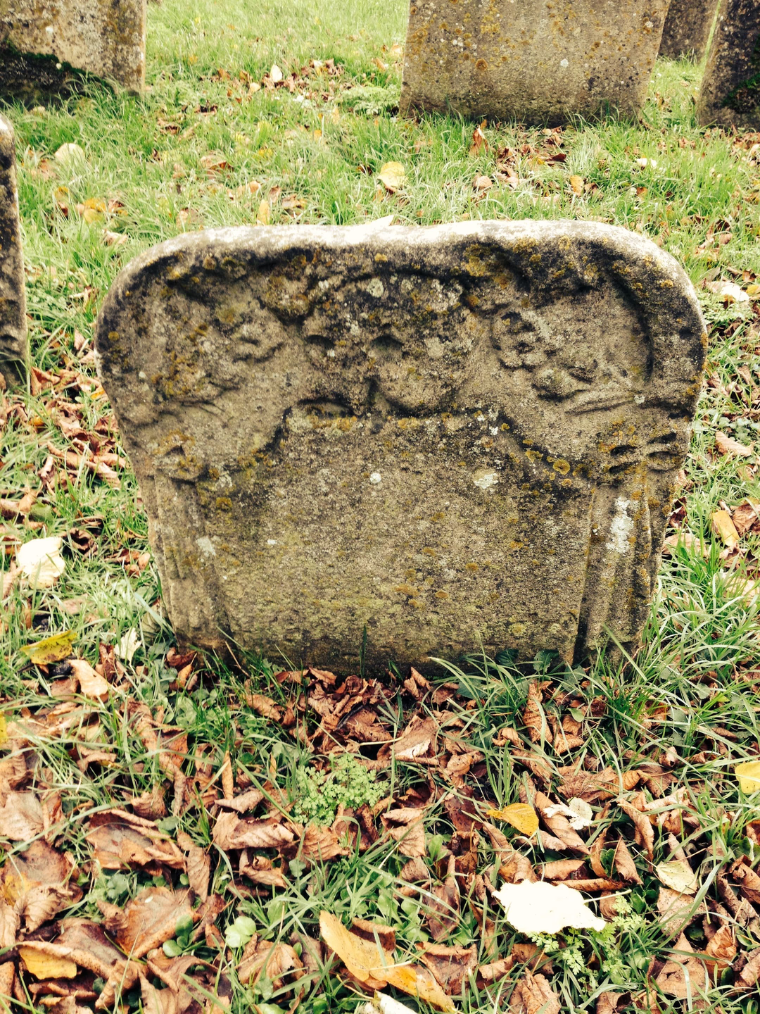
1680 to 1720: short, thick, winged skulls
“The earliest headstones at Burial Hill were typically about 2’ tall and made of gray or purplish slate. They were squat and thick with rounded tympanums flanked by high rounded shoulders. There was typically a winged head in the tympanum. Initially these were skull-like figures with large oval eyes, some with triangular noses and large teeth.” Side borders carried “abstract floral motifs,” and “The early lettering was fairly rough compared with later headstones.”
For foam, that means a stone about knee high, cut from a thicker stack than you’d think (the graveyard guide’s gluing section covers laminating), with big shoulders and a small inscription panel. Two details from this period are worth stealing:
- A heart-shaped panel. Hannah Bartlet’s 1710 stone has an hourglass, a skull, and “the inscription is set in a distinctive heartshaped tablet.”
- A stone carved decades late. “The Thomas Cushman (d. 1691) headstone was carved ca. 1716, 25 years after his death.” A stone dated 1691 can carry the style of 1716, and it’s historically defensible.
1720 to 1770: bigger panels, more elaborate tops
Stones got larger. “The main block is larger in relation to the shoulders, which have been reduced a narrow band on either side. The inscription panel has become more prominent and the lettering is more skilled.” The top got busier, with “skulls, cherubs, skeletons, scythes, tombs, hourglasses and vines used either individually or in combination.”
The nomination’s examples read like a motif list:
- Thomas Faunce, 1746: “a grim reaper with scythe sitting on an hourglass and a pair of wings rising from beneath the figure.”
- Hannah Cooper, 1763: “sometimes called a Medusa stone because it has the ‘electric hair’, which is characteristic of the early work of the Soule family of carvers”.
- Patience Watson, 1767, probably carved by William Codner, is “an early example of a portrait stone, which is more three-dimensional than other stones of the period and depicts an individual rather than a generic figure.”
Sources disagree on what a portrait stone shows. Burial Hill’s nomination says Watson’s “depicts an individual.” Boston’s parks department, writing about its own burying grounds, says portrait-stone images “are not actual portraits of the deceased person, yet they do realistically resemble people” (City of Boston).
1770 to 1800: faces give way to urns
The nomination describes a change in taste as “late 18th century winged faces yielded to the more secular, neoclassical symbolism.” Captain Thomas Davis’s 1785 stone shows “the stippling in the background of the tympanum and the columns in side panels,” and George Thomson’s 1798 stone is “gray slate with a large urn in the tympanum.” Stippling, a field of tiny dots behind the carving, is one of the easiest textures to reproduce in foam, and Part 2 covers it.
1800 to 1850: obelisk silhouettes and willows
“The obelisk shape, with tapered (rather than vertical) sides and pointed top, is a distinct style” at Burial Hill in this period. “The ‘succulent’ willow is a characteristic of the work of stone carver John Tribble.” Sally C. Robbins’s 1828 stone has “an urn with an eternal flame, a well-articulated willow, and a classically dressed grieving woman.”
One stone from this period carries a warning for anyone who treats a design as one carver’s work. Fanney Crombie’s 1804 portrait “has been attributed to William Coye, who signed the stone at the base, but the lettering has been attributed to Nathaniel Holmes. This is a good example of the pitfalls of gravestone attribution.” Carving and lettering could come from different hands, so a stone whose picture and letters don’t quite match is realistic.
After 1850: marble and the catalog stone
“After the 1850s, marble headstones were increasingly made in standard patterns and components rather than custom carving,” and “By late 19th century polished granite became the preferred material for gravestones because of its greater durability.” A Victorian stone should look more uniform than a colonial one. Build several from the same template.
Later Cemeteries, and Two Looks Nobody Builds
Burial Hill is New England slate. A community cemetery a century later looks different. The National Register nomination for Newtown Cemetery in Harrisonburg, Virginia, whose oldest dated stones are from the mid-1870s, lists “Headstone styles include tablet (basic, shouldered, domed, and stylized), lectern, capstone (with bronze cap for veterans), and obelisk.” Its “Symbolic motifs are both religious symbols in the Christian tradition” (cross, crown, Bible, wheat sheath, praying hands, angel, eternal flame, Last Supper) “and decorative elements” (lilies, ivy, sunrise, leaves, star, flower, leaved branch, geometric design, heart, Mason, draped cloth) (Newtown Cemetery National Register nomination, Virginia Department of Historic Resources, section 7).
Brief 48 adds two materials that are rarely built for Halloween:
- Cast zinc. “Cast zinc monuments were popular from 1870 through the early 20th century. Most cast zinc is bluish-gray in color” (p. 3). A blue-gray monument among pale marble stones is an accurate late-Victorian detail.
- Wood. Brief 48’s example is an 1877 wooden marker in Virginia City, Nevada. Its simplest markers are “field stone and basic wooden or wrought iron crosses, with the name of the deceased person scratched into or engraved on the marker” (pp. 1, 4). A weathered wooden headboard suits a Western or pioneer yard.
Character stones for a monster-movie yard work the same way. Build the stone in a real period shape and carve generic motifs: a full moon, a bat, lightning, a castle on a hill. Don’t copy a film studio’s character likeness onto the stone.
Where the Stones Face
Real burying grounds don’t all agree, which gives you permission to do what your yard needs.
- National Register Bulletin 41 describes “the scripturally-based tradition of orienting the foot of the grave toward the east,” and at Newtown “Most headstones are oriented east to face the rising sun.”
- At Burial Hill, “The headstones are oriented in all different directions, which is typical for burial grounds that developed over many years.”
For a yard, face the lettering toward the sidewalk, as the graveyard guide recommends. If you want a stone that tells a story, turn one to face a different way from the rest, as at Burial Hill.
If You Visit a Real Graveyard for Reference
Photograph, don’t touch. Among Brief 48’s ten common maintenance mistakes is visitors’ “use of chalk, shaving cream, and other materials to highlight carvings and lettering” (p. 8). Bulletin 41 describes the right way to photograph carving: “from near surface level and at times and under conditions when the high contrast of light and shadow will give sharpness and clarity to inscriptions and sculptural relief.” Low, raking sunlight early or late in the day shows the lettering without touching the stone.
Laying Out the Lettering: Our Method
This section is our method, not a documented historical practice. Our period epitaph tombstones are already laid out if you’d rather trace than design. For the words themselves, the graveyard guide’s epitaph section has real inscriptions from Library of Congress transcriptions.
- Draw the stone full size on paper first. Kraft paper or taped printer sheets both work. Mark the ground line: everything below it gets buried, so nothing gets lettered there.
- Decide the hierarchy. A motto or the carving goes at the top, then the opening words (“Here lyeth,” “In Memory of”), then the name in capitals, then the dates and age, then the verse. The name is the only line people read from the sidewalk, so it gets the tallest letters.
- Rule guidelines. Draw a baseline and a cap line for every row with a long straightedge. Keep the spacing between rows even. Our own rule of thumb is to make the name at least 2 inches tall on a full-size stone and the verse no smaller than about 1 inch, because thin grooves close up once they’re coated and painted.
- Letter the longest line first. Center it, then fit the shorter lines under it. Fold the paper in half vertically to find the center line.
- Match the period. Before 1720, Burial Hill’s lettering was “fairly rough,” so let it wander a little. By mid-century it was “more skilled,” so keep a later stone’s letters even. The long s, V for U and small raised letters are in the graveyard guide’s lettering notes.
- Check it from across the room. Tape the drawing to a wall and look at it from 15 feet. If the name doesn’t read, make it bigger before you cut anything.
Transferring the Design: Our Method
Again, this is our method.
- Outline. Tape the paper pattern to the foam and trace around it with a pencil or fine marker. For curved tops, see Part 2 for cutting arcs with a pivot pin.
- Letters and carving. Slip carbon or graphite transfer paper under the pattern and go over every line with a ballpoint or stylus. On soft XPS, pressing a little harder also dents a faint line into the foam, which survives if the transfer smudges. A pack of carbon transfer paper with embossing styluses covers a whole graveyard.
- Big stones. Our period epitaph templates carry a 1 inch square on every page for checking scale, and project well: shine the page onto the board with a projector and trace directly.
- Mark what gets cut away. Hatch the areas you’ll carve down, so you don’t mistake a letter for background once you start.
The drawn lines are the guide for Part 2: Carving and Fume Safety, which covers which tool cuts what, the maker’s instructions for each, and what the fumes really contain.
Put It to Work
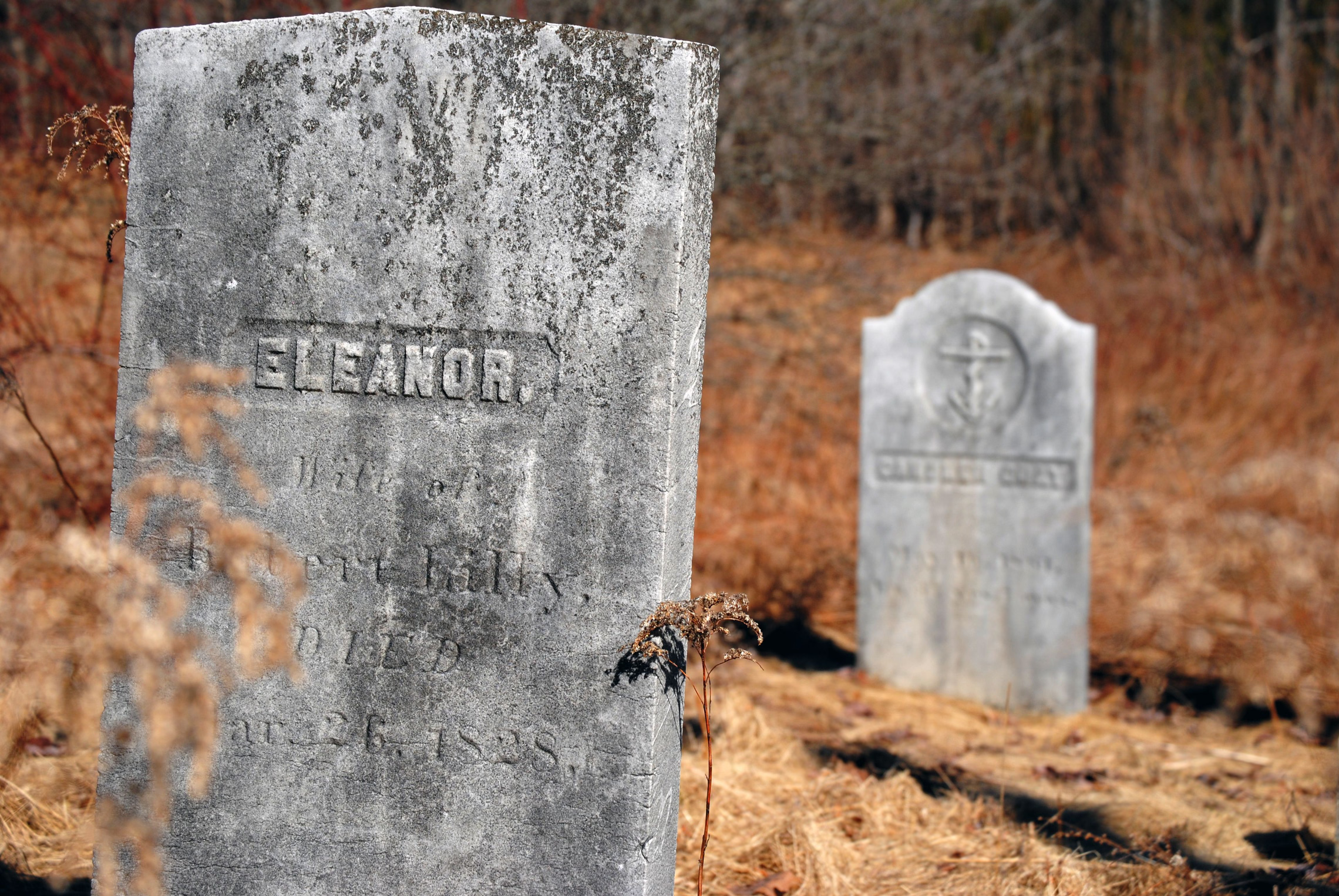
How to Build a Front-Yard Graveyard That Looks Genuinely Old
Foam tombstones that survive October, paint that won't melt them, anchoring that won't impale anyone, and the lean and clutter of a real colonial burying ground.

Mannequins and Dressed Props: How to Make a Figure Look Real
Store mannequins, dress forms, skeletons and PVC frames compared, plus padding a tiny display body into real clothes, heads and hands, Rit dye by fiber, painting plastic, blood on fabric, lighting a face and keeping a dressed figure alive outdoors.

How to Build a Pirate Cove Yard Haunt
A skeleton crew, a wrecked bow, a smoking cannon and a lit treasure chest: where the pirate look really comes from, what the Dead Water ship's manual forbids, how to duct fog into a cannon, LED-only lanterns, a blue sea without water, and shanties that aren't pirate songs.